
OUR FAVORITE BEACH HOUSE COLORS

FIND THE PERFECT COLOR FOR YOUR BEACH HOUSE PROJECT
One of the most common things we hear on consultations is how long our clients spend staring at paint colors trying to land on just the perfect shade.
There are so many factors to consider when searching for paint. Various hues and tints to choose from. Do I want a cool or warm color? How is the lighting in the room? Should I go for a bold pop of color or a timeless neutral? Will that neutral be boring? Biggest and most important factor… your design style!
If you live in a home in Florida, chances are you’re in search of the perfect coastal balance or just enough beachy flair, without looking gimmicky, or too traditional. We have collected some of our favorite hues for the modern beach house look, that will get you just that!
While you scroll through the colors below take a moment to discover what feelings arise in you! Design is much more about how you feel in your space, than anything else!
SW 9632 Serenely
Our first color is Serenely. We just used this color in a client’s Siesta Key waterfront home, and it has quickly become one of our favorites. Tranquil and inviting. Comforting and cozy. Just the right mix for relaxing in your master suite!
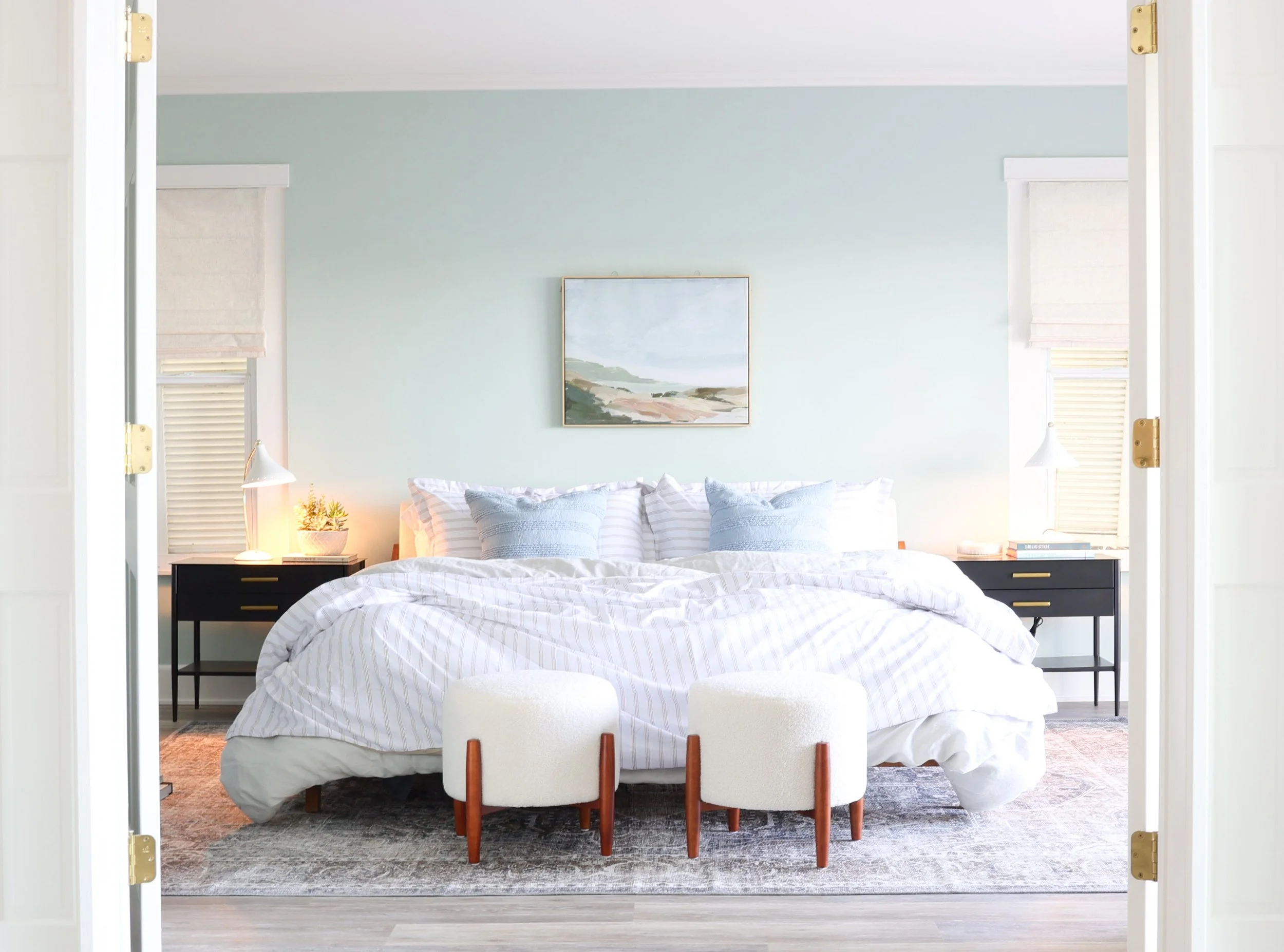
SW 9632 Serenely - Honors Interiors Siesta Key MCM Beach House Project
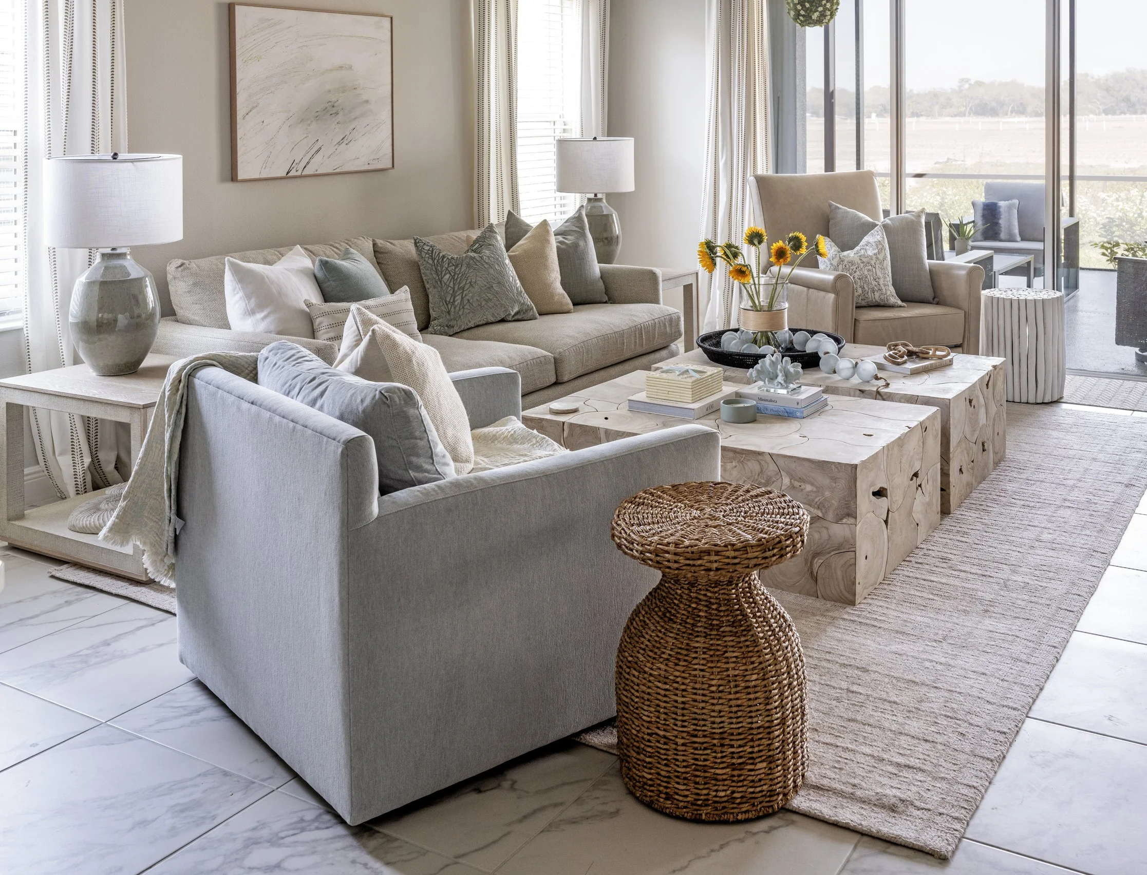
2. BM Steam AF-15
Steam is another favorite! In most homes we use a neutral, such as this one, on my most of the walls, and save the more vibrant colors for accent walls, bathrooms, or a special space you want to emphasize. It’s a good way to create an overall coastal feeling without being over the top. It creates a crisp but still warm back drop for a layered space, like the Steam walls, white oak cabinetry, beautiful fireplace tile, and subtle blue sofas in this living room we recently completed as part of a whole-home remodel.
We love this warm off-white, because it’s perfect to achieve the organic neutral look without making the space feel cold. It has a slight cream undertone, which makes it perfect to pair with warm wood, blues and pastels. You know the feeling of the velvety soft sand on Siesta Key? Bright and beachy meets cozy and warm, all day long!

BM Steam AF-15 - Living Room by Honors Interiors
3. SW Drift of Mist
Still Water is the next color we’ll dive into! This color makes me think of the quiescent sea and the gloomy sky just before a storm rolls in. Admiring the calm of the storm when the cool air begins to drift along. It makes me want to draw a bath and open the windows. The sound and smell of the rain soothes the soul. Relax in the still water and drift into your surroundings. This is the perfect color for a moody feature wall or accent cabinetry.
SW - Designed by Honors Interiors
5. SW 6204 Sea Salt
Of course we couldn’t leave out, cult favorite, Sea Salt! It’s like ambient noise: calm and peaceful. Crashing waves gliding in and out with the tide. Crystalized salt forms to shells as it softens the edges. Sea Salt is light and airy, making it the perfect setting for a reading room or a guest space! We use this color over and over again, and it’s always a hit. Bright without being overpowering, it lends itself to a number of esthetics, whether you lean more modern or more traditional, this color creates a nice balance.
SW 6204 Sea Salt - Design by Honors Interiors
Need more help choosing the perfect colors for your home?
Our lead designer, Laura Honors, is a Maria Killam True Color Expert, and offers in-home color and finish consultations to our Sarasota and surrounding area locals!